9 Admin Dashboard Design Mistakes That Slow Your Team Down
Vanity charts, slow tables, missing bulk actions and more. Nine common admin panel and dashboard UX mistakes, with practical fixes for each.
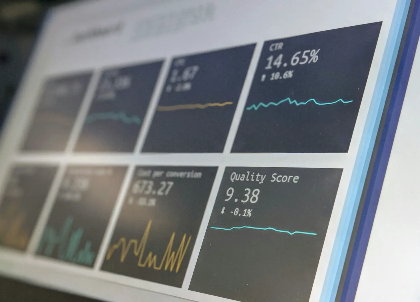
Internal tools rarely get the design attention customer-facing products get. Yet your operations team might spend seven hours a day inside the admin panel. Every extra click, slow table and confusing screen is paid for in salaries, mistakes and frustrated staff.
These are the nine mistakes we see most often when we redesign or rebuild dashboards, and how we fix them.
1. Designing for the demo instead of the daily user
Dashboards are often approved by a founder or manager in a meeting, so they get designed to impress in that meeting: big charts, dark themes, animated numbers. Then the people who actually use the tool all day find that the one thing they need, like the list of today’s pending orders, is three clicks deep.
Fix: spend an hour watching the real users work before designing anything. List the five tasks they do most and make each one reachable from the home screen in one click.
2. Too many numbers on the home screen
Twenty KPI cards feel thorough. In practice nobody reads them, and the two numbers that matter get lost. If a number does not lead to a decision, it is decoration.
Fix: keep three to six metrics on the main screen, each with context (compared to yesterday, last week or a target) and a link to the list behind it. If revenue is down, one click should show which orders or products caused it.
3. Charts where a table would do
Charts are good for trends. They are bad for finding a specific customer, order or invoice. Many dashboards force people to hover over a chart to read an exact value they could have read instantly in a table.
Fix: use charts to answer “how are we trending?” and tables to answer “which ones?”. Most operational screens should be tables with good search and filters.
4. No sensible defaults
If every user opens the orders page and immediately sets the same three filters, the defaults are wrong. Date pickers that start at “all time” on a table with a million rows are a classic example.
Fix: default to the view people use most (today, this week, “my” items, status pending) and remember each user’s last filters. Saved views for common combinations are cheap to build and save hours.
5. Tables that fall over with real data
A table that works with fifty test rows freezes with fifty thousand real ones. Loading everything into the browser and filtering there is the usual cause.
Fix: paginate, search and sort on the server, load only the columns you show, and index the database fields people filter by. A table should respond in well under a second, whatever the size of the data behind it.
6. One-at-a-time actions
Approving forty vendor listings one by one, each with a confirmation dialog, is the kind of task that makes people hate a tool.
Fix: add checkboxes and bulk actions for anything done more than a few times a day: approve, assign, export, change status. Add keyboard shortcuts for power users.
7. Everyone sees everything
When every user is an admin, mistakes are inevitable and sensitive data like customer phone numbers or salaries is exposed to people who do not need it.
Fix: define roles from day one (admin, manager, staff, read-only) and show each role only the menus and actions it needs. A simpler screen is also a faster screen to learn.
8. Forgetting empty, loading and error states
Designers mock up screens full of perfect data. Real life includes new accounts with no data, slow connections and failed requests. A blank white area leaves users unsure whether something is loading, broken or simply empty.
Fix: design every screen in four states: loading, empty (with a hint about what to do next), error (with a clear message and retry) and full.
9. No audit trail or undo
“Who changed this price?” is a question every growing team eventually asks. Without a history of changes, nobody knows, and fixing mistakes means guessing.
Fix: log who changed what and when for important records, and offer undo or soft delete for destructive actions. It builds trust in the tool as much as it prevents disasters.
A quick self-check
- Can a new staff member complete their most common task without training?
- Does every number on the home screen lead to an action?
- Do large tables load in under a second?
- Can you see who last changed an important record?
- Does each role see only what it needs?
If you answered no to two or more, your team is probably losing hours every week to the tool. We design and build custom dashboards and admin panels around real workflows, and our UX audits can pinpoint what to fix first in the tool you already have.
FAQ
Frequently asked questions
What makes a good admin dashboard?
A good admin dashboard is built around the tasks people do every day. It shows only the numbers that lead to action, makes common tasks fast, loads large lists quickly and gives each role access to exactly what it needs.
Should we build a custom admin panel or use an off-the-shelf tool?
Off-the-shelf tools and low-code builders are great for simple internal tools. A custom admin panel makes sense when workflows are specific to your business, data comes from several systems, or the tool is used all day by many people.
How many KPIs should a dashboard show?
Usually three to six on the main screen, each tied to a decision someone makes. Everything else can live in reports or detail pages.
Keep reading
More guides
How Much Does a Website Cost in India in 2026? A Line-by-Line Breakdown
Real 2026 price ranges for business websites, Shopify stores and custom builds in India, plus the yearly costs most quotes leave out.
Next.js vs WordPress for a Small Business Website: An Honest Comparison
Speed, SEO, security, editing and cost compared. When WordPress is the right call for a small business, and when Next.js is worth it.
Shopify vs a Custom eCommerce Website: When Does Custom Actually Pay Off?
Plan fees, app costs and transaction fees over three years, and the clear signs your store has outgrown Shopify. A practical guide for Indian brands.